
My First Tailwind Website
What I built
A multi-page website with a home page and a gallery page. Built using HTML and Tailwind CSS.
Classes Used
Header
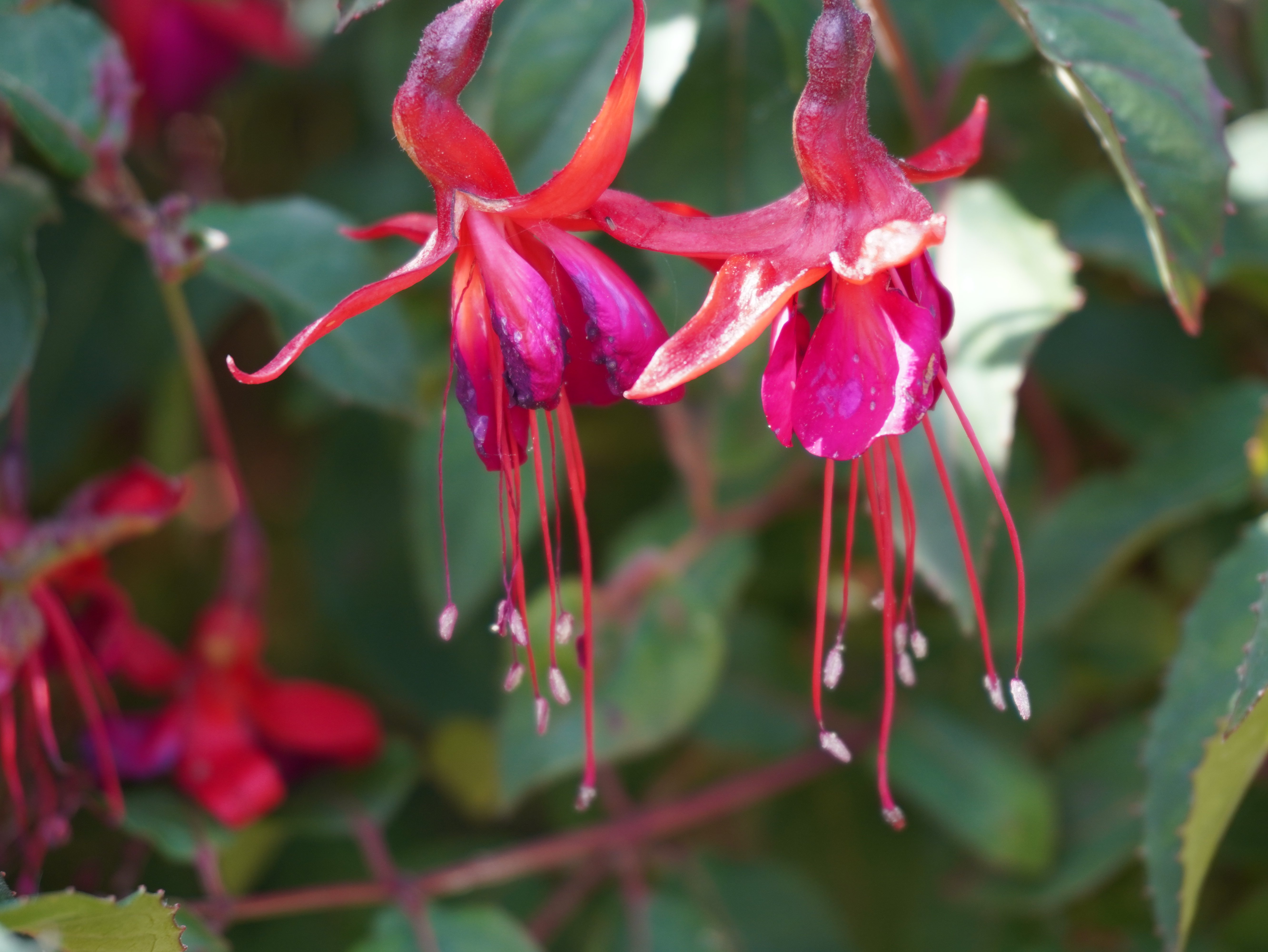
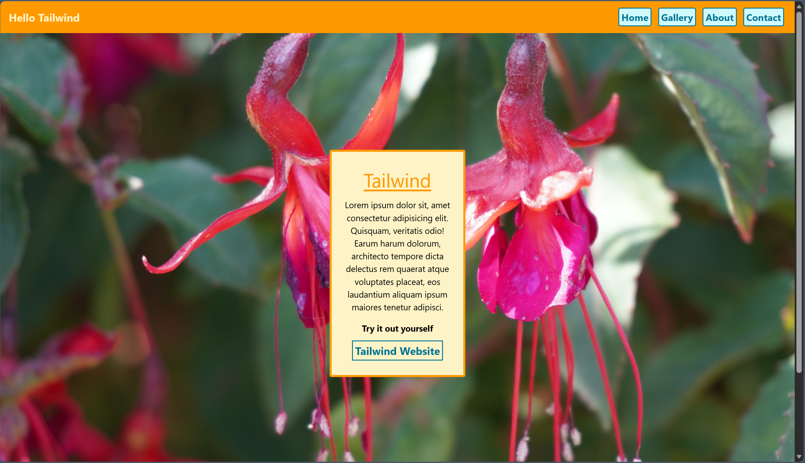
For my gallery, I took photos of flowers and plants, so I decided on a tropical colour theme. This gave me a good starting point when building the design. For the header and footer, I added an amber coloured background to match the custom background I chose for the main body of the home page.
I added padding for spacing and chose a font style. I aligned my elements using flex properties.
<header class="bg-amber-500 p-4 font-bold flex justify-between">
For the navigation links, I created borders with a cyan colour and added the rounded class to soften their appearance.
<a href="index.html" class="border-2 border-cyan-700 rounded">
I then chose a size and colour for the text by using the text class. I added a less opaque cyan to the background for a cohesive aesthetic.
<a href="index.html" class="border-2 border-cyan-700 rounded text-sm text-cyan-700 bg-cyan-100">
To polish the appearance and add clarity, I inserted padding p and margins m and centred my text.
<a href="index.html" class="border-2 border-cyan-700 rounded text-sm text-cyan-700 bg-cyan-100 text-center p-1 m-1">
For responsiveness, I added the following classes to my heading.
w-40 sm:w-auto text-4xl sm:text-xl
This makes the default text size four times extra large; when the screen size increases past the small-screen breakpoint, the text scales down to extra large. (Bigger screen, smaller text). To wrap the text underneath, I altered the width.
For the links, I added the following:
block sm:inline
This shifts the direction of the navigation links when changing the screen size.
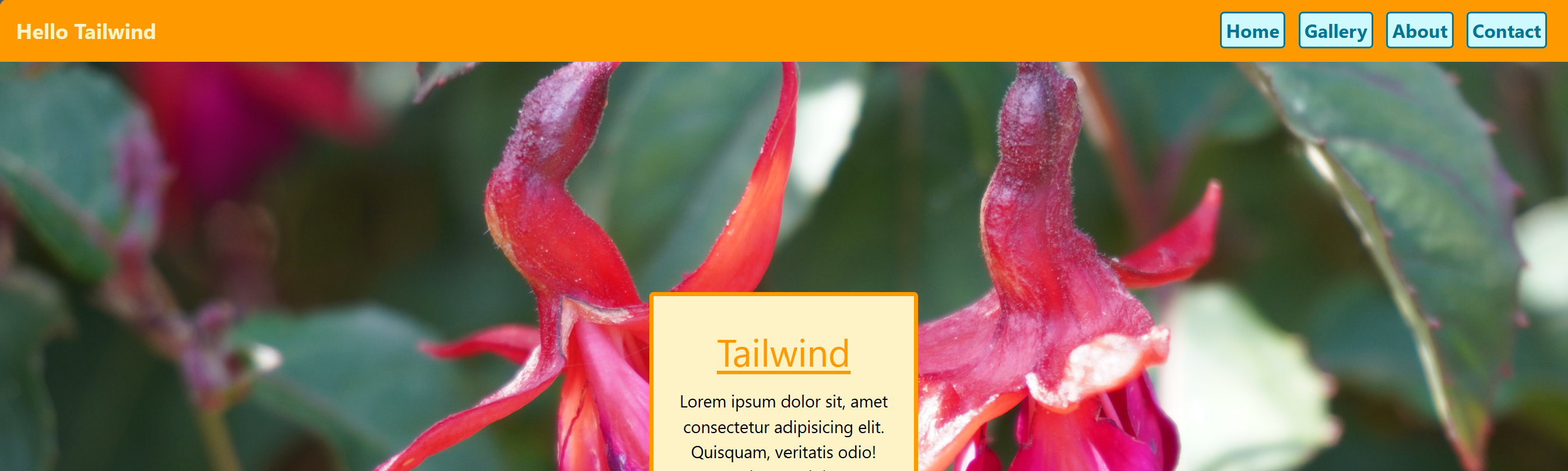
text-xl and inline
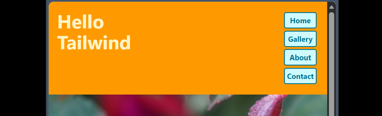
text-4xl and block
Main Section
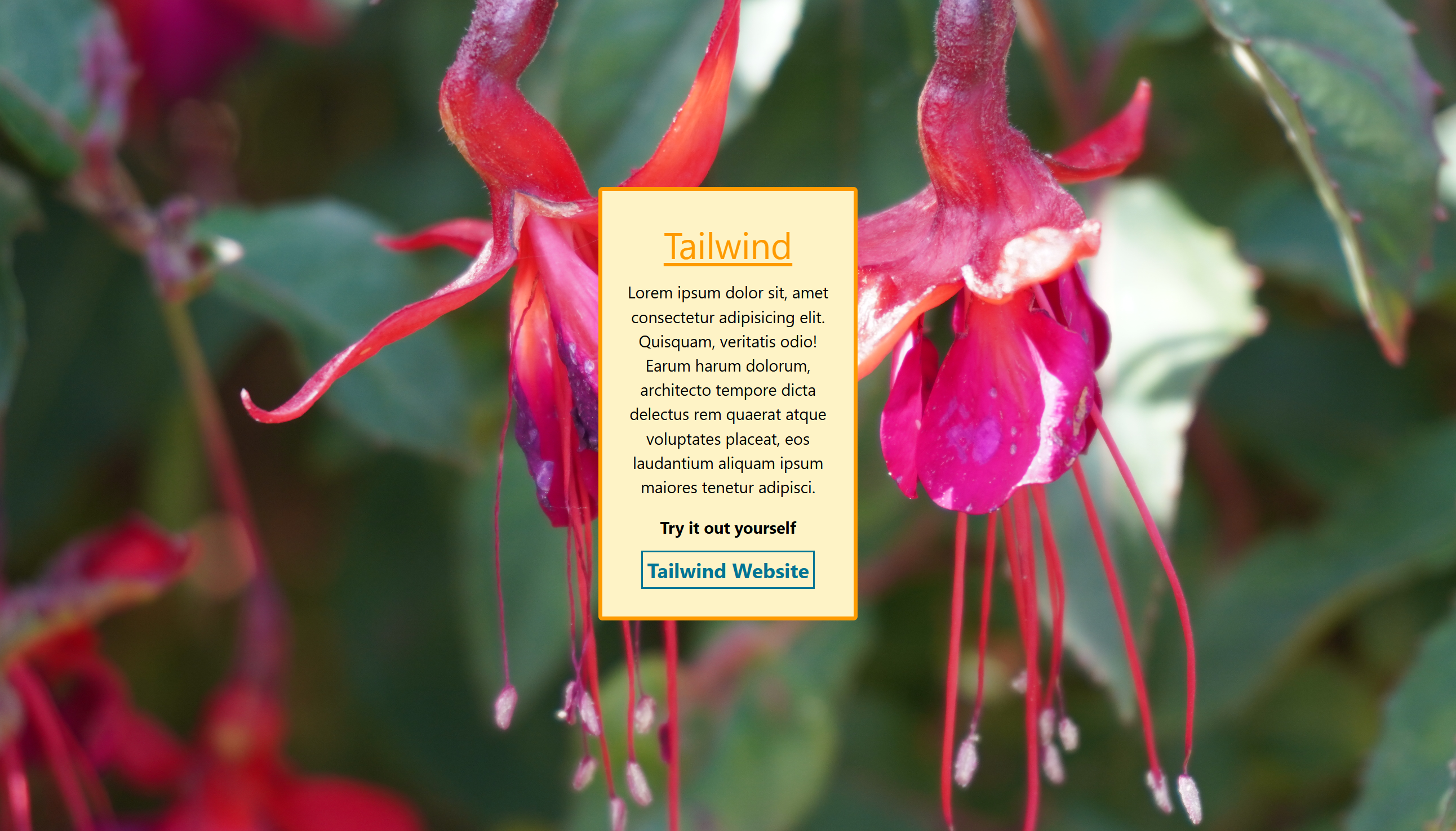
I started with a div element for the body, and added the h-screen class to make it take up the full height of the screen.
To centre everything, I added flex and centred everything across the y-axis and x-axis.
<div class="h-screen flex justify-center items-center">
To customise the background, I used the bg class and inserted the file of the specific image I wanted to include. Then used the cover property to fill the entire space of the body.
<div class="h-screen flex justify-center items-center bg-[url('background.JPG')] bg-cover">
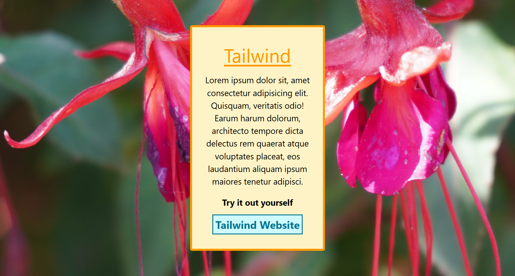
For an interactive feature, I added the hover pseudo-class to the link and added the background colour I wanted to create the effect.
hover:bg-cyan-100
Footer
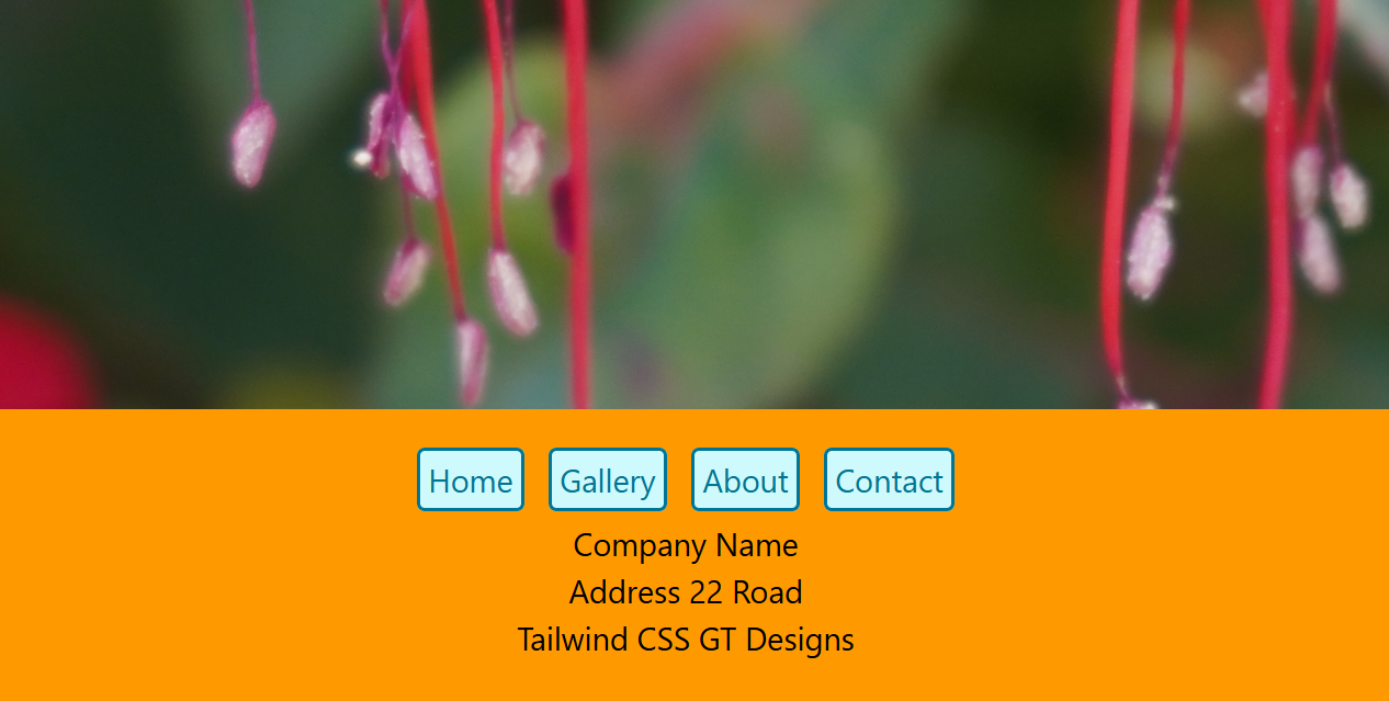
I started with a similar style to the header, but instead centred the navigation links and added some extra text. I added flex to centre everything.
<footer class="bg-amber-500 flex justify-center">
I created a div element for the links and text to adjust their positions into a block format.
<div class="text-center p-3">
To add some spacing between the links and text, I created a div element to contain my paragraphs. I then added a top margin of 2 to my div element.
<div class="mt-2">
        <p>Company Name</p>
        <p>Address 22 Road</p>
        <p>Tailwind CSS GT Designs</p>
        </div>
Gallery
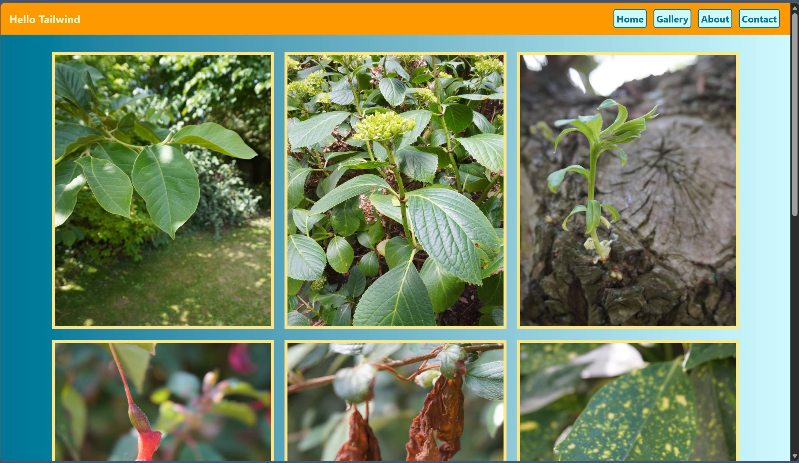
To create a gradient background, I added the bg class to the body of my HTML, with the colours going from left to right.
<body class="bg-gradient-to-r from-cyan-700 to-cyan-100">
I then created a div element to act as the container for the grid items. I chose 9 images to include; therefore, I created an equal 3x3 grid. I started by adding the grid class, and to create the number of columns I wanted, I used grid-cols.
<div class="grid grid-cols-3">
For even spacing between each image, I added a gap of 5. I also added margin classes to show space from the header and footer, and the mx class to control the spacing horizontally. Then centred everything using flex properties.
<div class="grid grid-cols-3 gap-5 m-8 mx-24 flex justify-center items-center">
For the images, I chose the same size for each image using custom width and height classes and added borders.
<img class="size w-110 h-130 border-6 border-amber-200" src="Flower1.JPG" alt="Itonlinelearning Coding Challenge">
For responsiveness, I used various screen breakpoints to override the default styles I added. To apply the styles only when the viewport is smaller than the breakpoint, I added the max property.
max-sm:flex max-sm:flex-wrap max-sm:justify-items-center max-md:flex max-md:flex-wrap max-lg:grid-cols-2 max-lg:justify-items-center
This adjusts the number of columns as the screen changes in size. I reduced the number of columns to 2 for medium screens and 1 for small screens, and added flex-wrap so the images would move under one another.
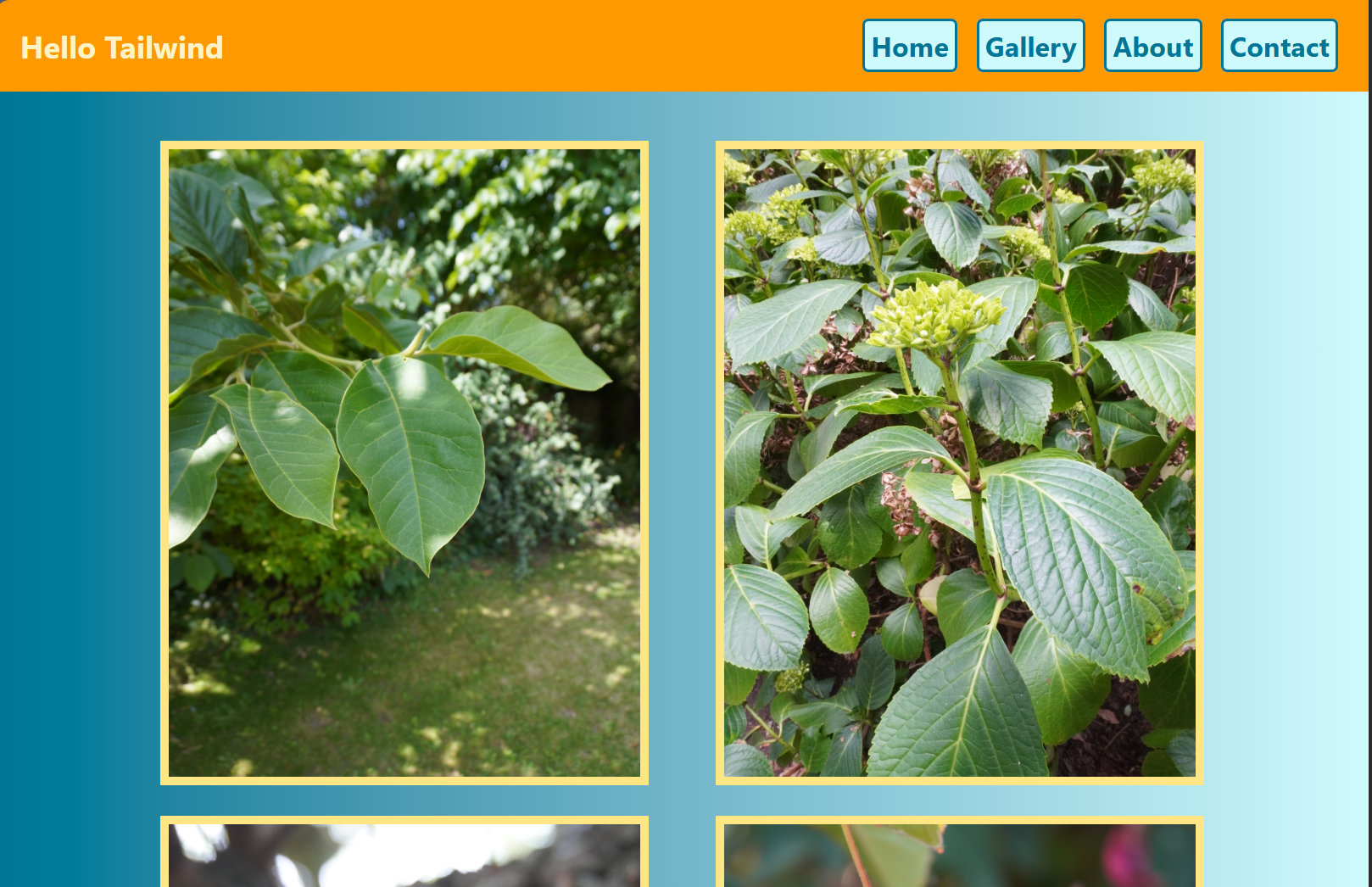
Medium screens
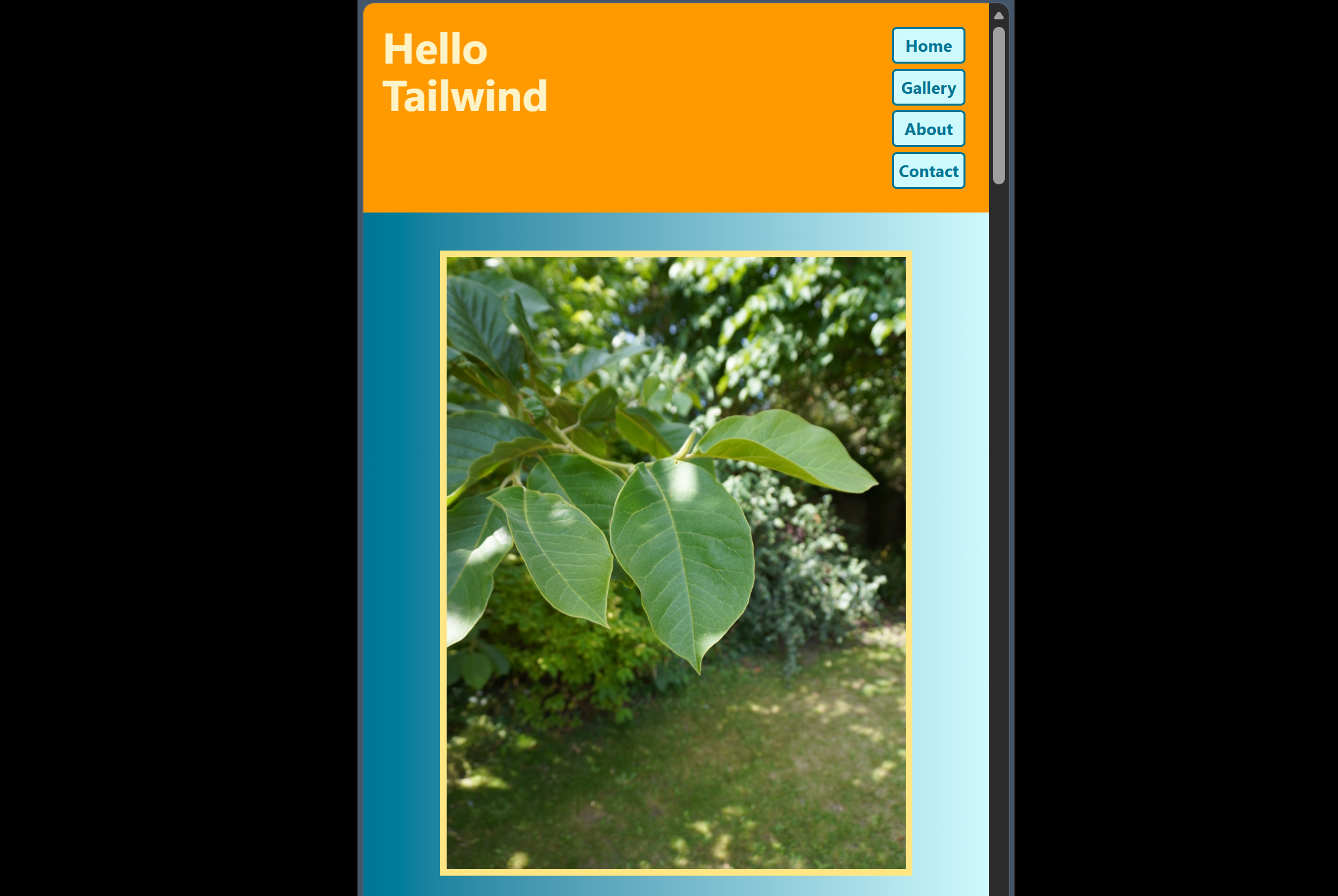
Small screens
Challenges
This was my first time creating a website using only Tailwind CSS for the design and layout. With standard CSS, you can write your HTML and add your design separately afterwards, referring to the same elements in one CSS section using selectors, whereas in Tailwind, you have to refer to each element directly. I found this good for breaking down my design into one section at a time, but of course, it means a bit of repetition. Once my code was bulking up, I found myself getting a bit lost in where elements were.
It also took time to learn the shorthands for certain properties. In standard CSS, the name is written in full; in Tailwind, sometimes just a letter is used. I had to regularly check the Tailwind Docs page.
One of the biggest challenges for me was the gallery section. In standard CSS, there's a lot of flexibility with a grid layout; for example, you can use grid-template-areas to arrange your grid items, but in Tailwind, that property doesn't exist. It took a bit of time to figure out what the equivalent utility classes were in place of the standard CSS properties and values.
Improvements
To improve the website, I would make the responsiveness more effective. The images overlap at certain points while decreasing the size of the screen. I'd like the images to stay equally spaced apart but scale down consistently and wrap automatically.
By playing around with different font styles, I could have made some of the text more visually enticing, such as in the footer and paragraph section.
View the LiveSite
Watch the YT Walkthrough